

Back
[Case 02]
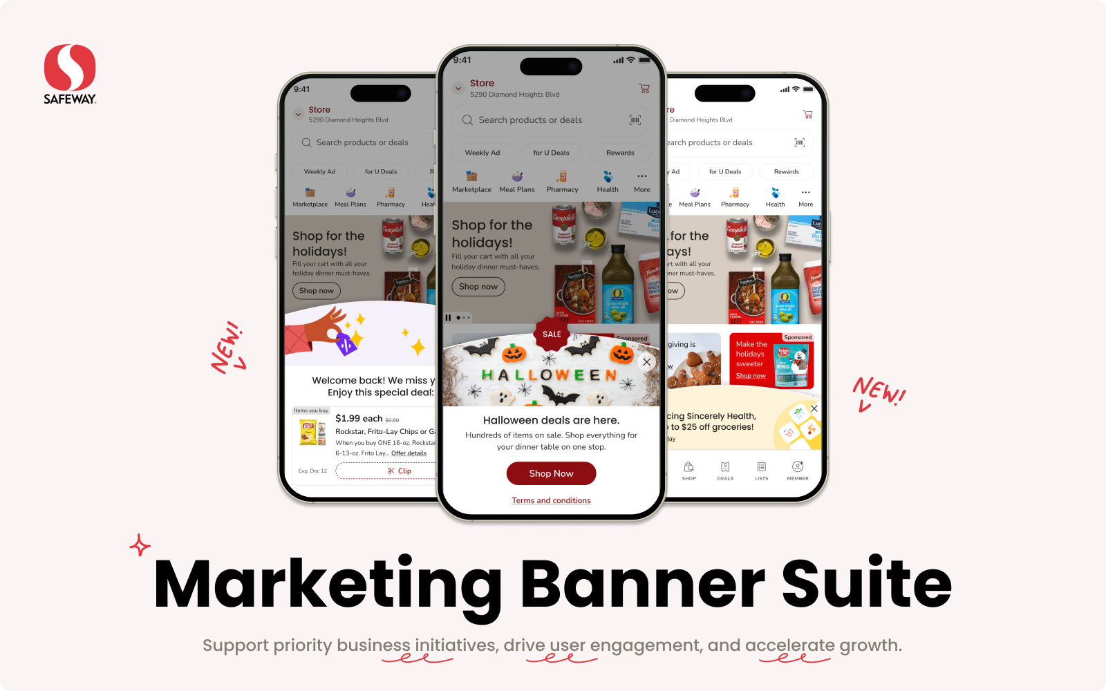
Accelerate growth by launching Marketing Banner Suite
Scaled feature for Omni-channel grocery shopping experience Increased CTR to 5.5%. Heavily used for promoting organization priority programs.
[Project Overview]
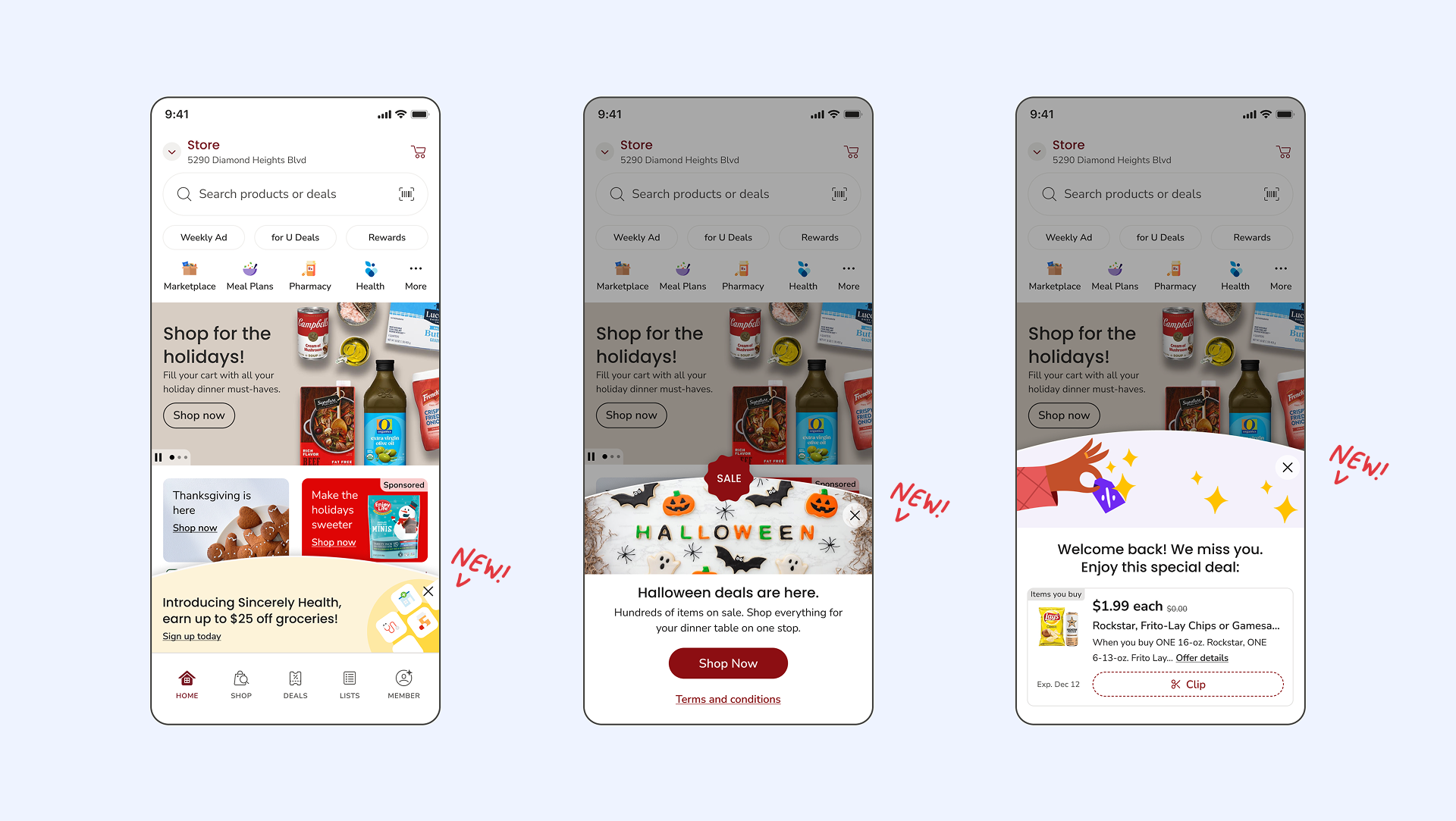
Home screen faced conflicted messaging UX issue- multiple popup screens appeared on the same time. I designed the marketing banner suite to address the lack of components and guidance, furthering increased business initiatives visibility and engagement.
[Achievement]
It solved a lot of existing UX issues and has reached a increased CTR of 5.5%. It scaled and is heavily used for promoting organization priority programs such as omni conversion, Flash, cyber sales, etc.
[Industry]
E-commerce
[My Role]
Product Designer
[Platforms]
Mobile App
[Timeline]
1 quarter | 2024
[Collaboration]
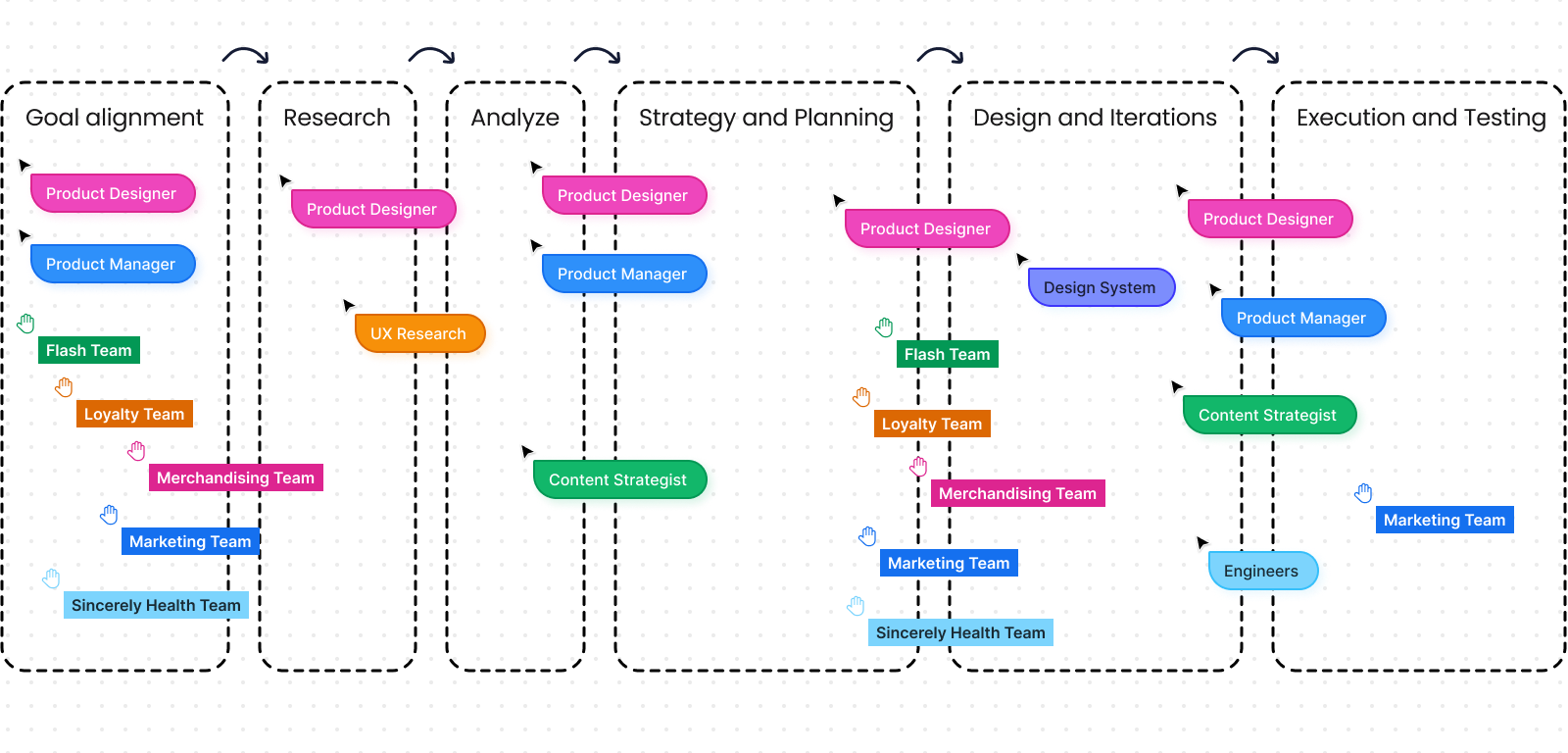
Cross-functional team collaboration was a huge part of design work.
- 1 Product Manager
- 1 UX Research
- 1 Content Strategist
- 3 Engineers
- Multiple workshops with cross-functional teams
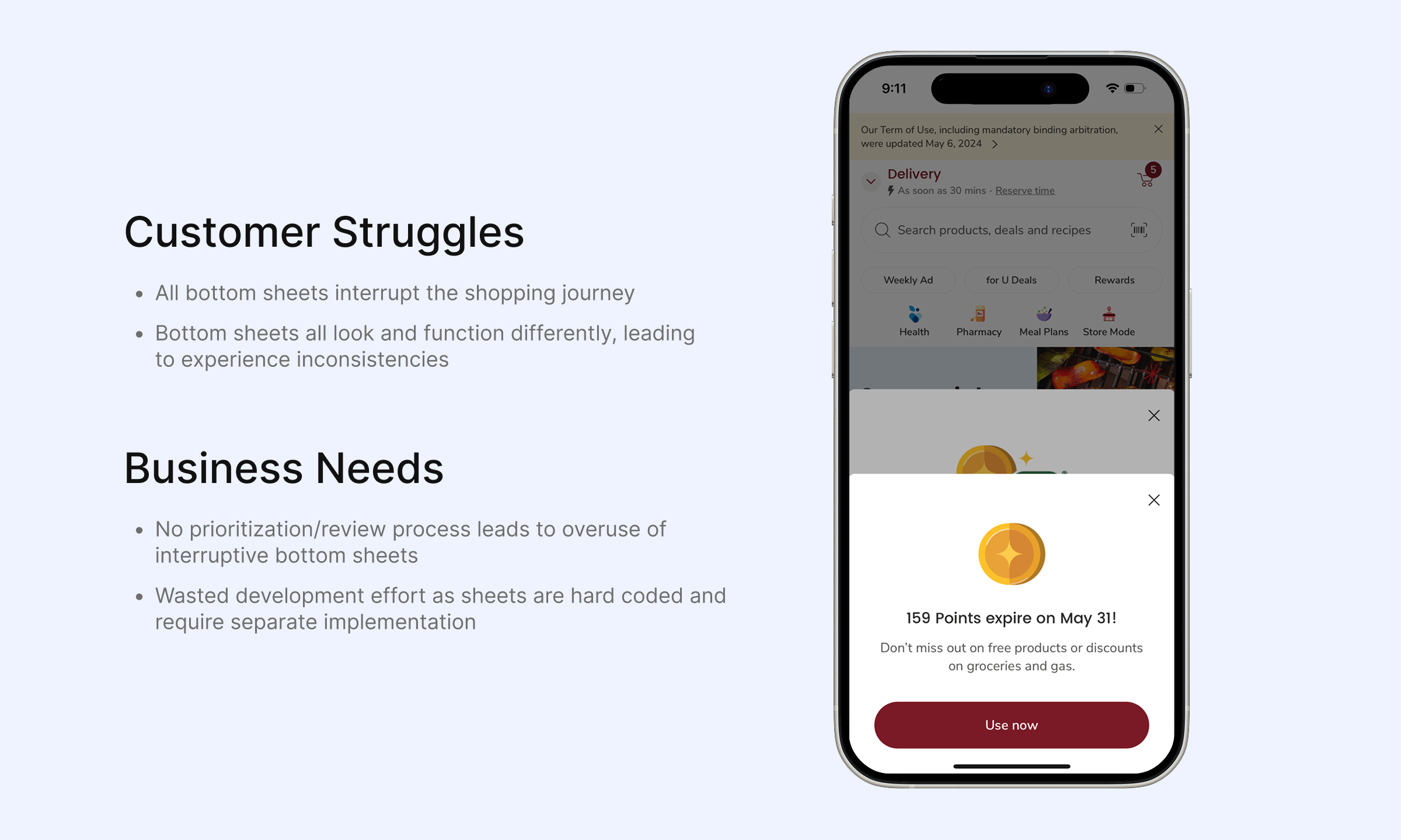
[Problem]
High-priority campaigns or business initiatives can only use Bottom Sheet or Notification Banner to deliver message. Due to the inconsistent in-app messaging, they didn’t get the visibility they need, leading to lower awareness and engagement.
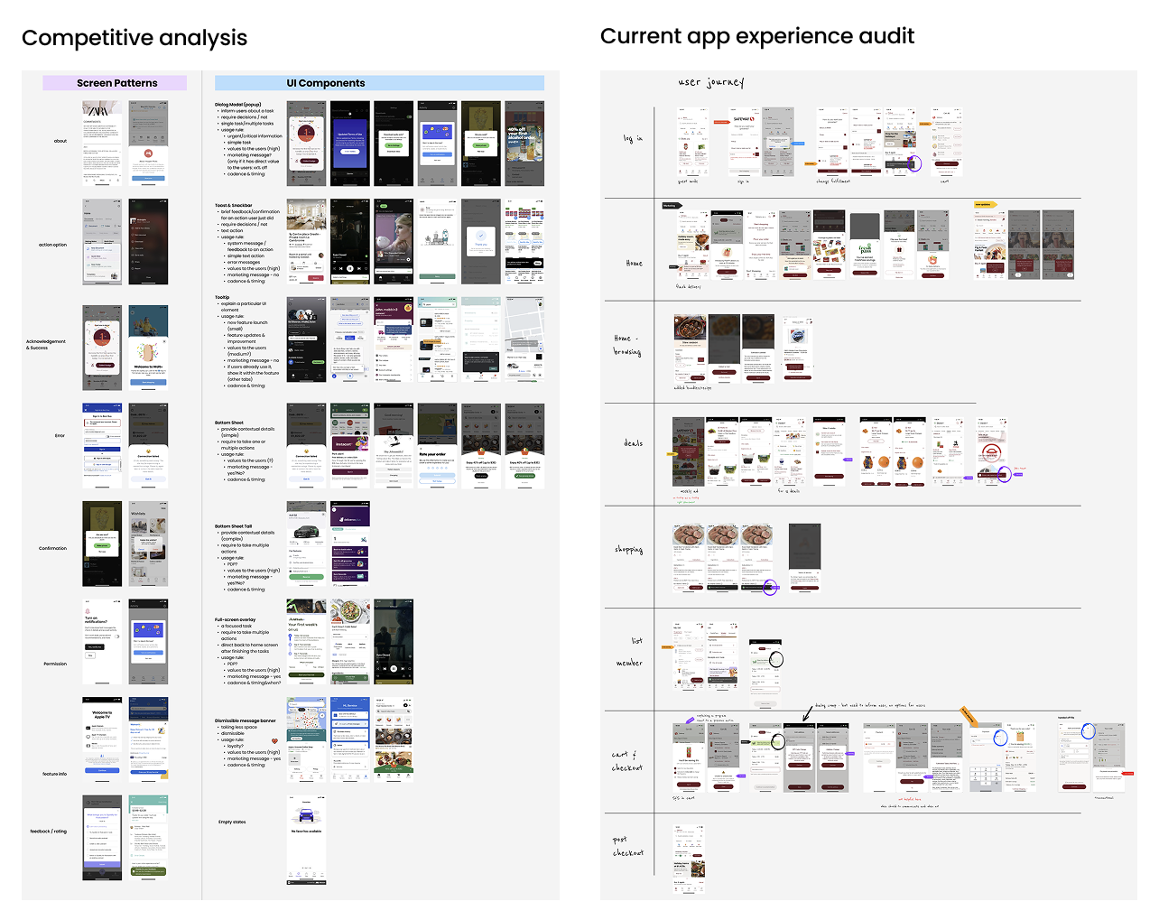
[Analysis]
We have hosted workshops with cross-functional teams to understand the underlined problem:
→ Due to the lack of guidance on pop-up components usage and cadence, teams had to fight for the real estate on Home screen. It resulted in multiple sheets appearing on the same time, conflicted messaging delivered to the end users and interrupted their shopping journey.
[Solution]
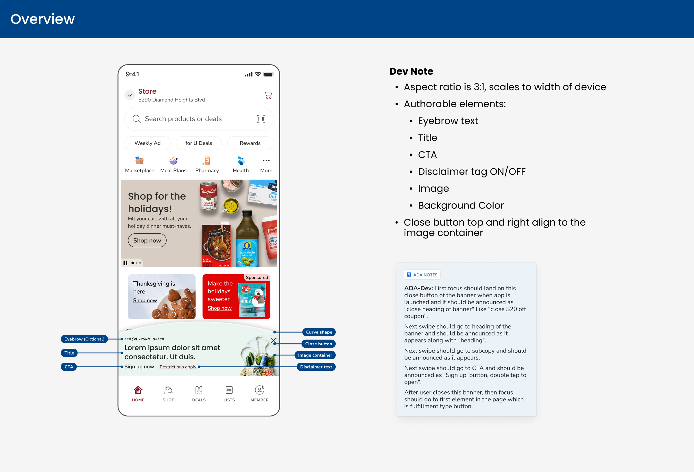
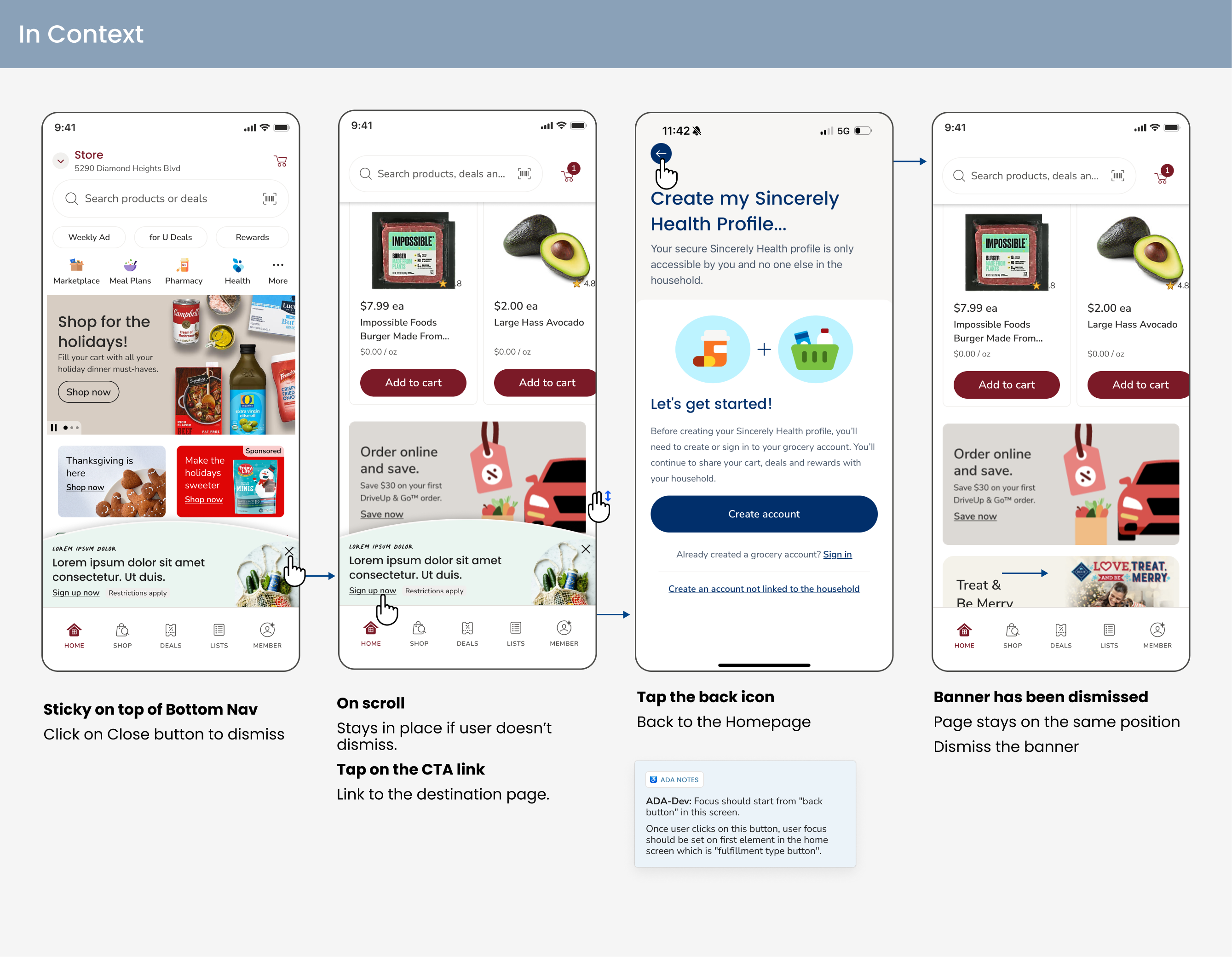
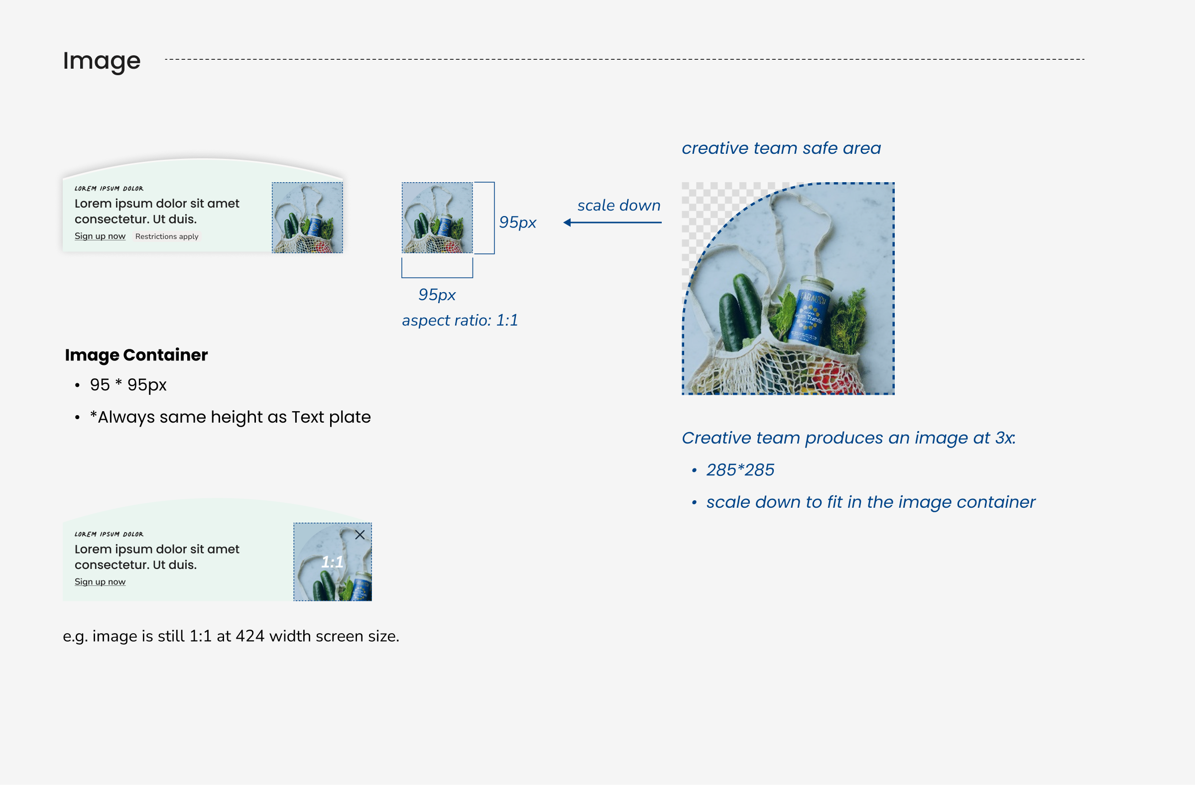
- New Components: Shipped a suite of Marketing Banners designed for different levels of messaging priorities.
- Messaging Guideline: Published [in-app Messaging Playbook] to facilitate decision making between teams (See Case Study 03 for details)
[Deliverables]
- Shipped Development-Ready files.
- Published Component Authoring Guideline for Merch Team and Marketing Team.

[Achievements]
Fixed UX issues
fixed the overlapped pop-up issues
5.5%
increased the CTR to 5.5%
Scaled
heavily used for promoting org initiatives
[Key Learnings]
- Collaboration: hosting fun workshops both individually and collectively can help aligning the goal more efficient.
- Balancing business needs and end-customers satisfaction: our customers come to the app with intention, pop-ups in most case will interrupt their shopping journey unless it’s beneficial to them.
- Project scope: this project scope increased when we deep dived into the underlined problem. We felt the urgent to launch an internal messaging playbook to help cross functional teams better reach their audience on the right time.
Back
[Case 02]
Accelerate growth by launching Marketing Banner Suite
Scaled feature for Omni-channel grocery shopping experience Increased CTR to 5.5%. Heavily used for promoting organization priority programs.
[Project Overview]
Home screen faced conflicted messaging UX issue- multiple popup screens appeared on the same time. I designed the marketing banner suite to address the lack of components and guidance, furthering increased business initiatives visibility and engagement.
[Achievement]
It solved a lot of existing UX issues and has reached a increased CTR of 5.5%. It scaled and is heavily used for promoting organization priority programs such as omni conversion, Flash, cyber sales, etc.
[Industry]
E-commerce
[My Role]
Product Designer
[Platforms]
Mobile App
[Timeline]
1 quarter | 2024
[Collaboration]
Cross-functional team collaboration was a huge part of design work.
- 1 Product Manager
- 1 UX Research
- 1 Content Strategist
- 3 Engineers
- Multiple workshops with cross-functional teams
[Problem]
High-priority campaigns or business initiatives can only use Bottom Sheet or Notification Banner to deliver message. Due to the inconsistent in-app messaging, they didn’t get the visibility they need, leading to lower awareness and engagement.
[Analysis]
We have hosted workshops with cross-functional teams to understand the underlined problem:
→ Due to the lack of guidance on pop-up components usage and cadence, teams had to fight for the real estate on Home screen. It resulted in multiple sheets appearing on the same time, conflicted messaging delivered to the end users and interrupted their shopping journey.
[Solution]
- New Components: Shipped a suite of Marketing Banners designed for different levels of messaging priorities.
- Messaging Guideline: Published [in-app Messaging Playbook] to facilitate decision making between teams (See Case Study 03 for details)
[Deliverables]
- Shipped Development-Ready files.
- Published Component Authoring Guideline for Merch Team and Marketing Team.
[Achievements]
Fixed UX issues
fixed the overlapped pop-up issues
5.5%
increased the CTR to 5.5%
Scaled
heavily used for promoting org initiatives
[Key Learnings]
- Collaboration: hosting fun workshops both individually and collectively can help aligning the goal more efficient.
- Balancing business needs and end-customers satisfaction: our customers come to the app with intention, pop-ups in most case will interrupt their shopping journey unless it’s beneficial to them.
- Project scope: this project scope increased when we deep dived into the underlined problem. We felt the urgent to launch an internal messaging playbook to help cross functional teams better reach their audience on the right time.